Why visualisation matters
With business decisions being increasingly based on insights from more and more data, the ability to present data in ways that make it clear, interactive and compelling is becoming increasingly important. The ability in this way to turn data into usable information has for a long time been an important part of Business Intelligence but now we believe it is fast becoming its own discipline, and to illustrate the point (pun intended) in this article we consider some of the best aspects of a number of visual representations that we have come across. The representations were developed by a variety of people, not by Red Olive – after all, it’s much easier to critique other people’s work.
With cutting-edge design work and new technology, a good visual representation can transform unintelligible data into a useful and exciting graphic format. These visualisations can be works of art, such as the fascinating examples of ingenious infographics collected in David McCandless’ aptly titled book, Information is Beautiful.
It’s not just about making statistics look pretty. Visualisation is an important part of any business’s information strategy; it’s about making sense of your data.
Visualisation: make sense of your data
Once you have whatever data it is that you want to present, you can make use of the many visualisation tools that are available.
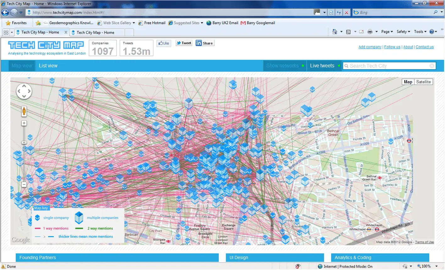
An effective visualisation should clearly represent your data in an accessible graphic format. For example, if your dealing with data where the physical location is important, why not try super-imposing your data onto a map? The map here illustrates data collected from live Tweeting between East London businesses. It still looks complex, but just think how much easier to interpret this map format is than a set of figures in a table. The thicker the lines, the more the Twitter dialogue relating to the two businesses in question:
Data visualisation is also increasingly being adapted to match specific business branding. In this example, a colour palette has been created to tie in with the company branding:
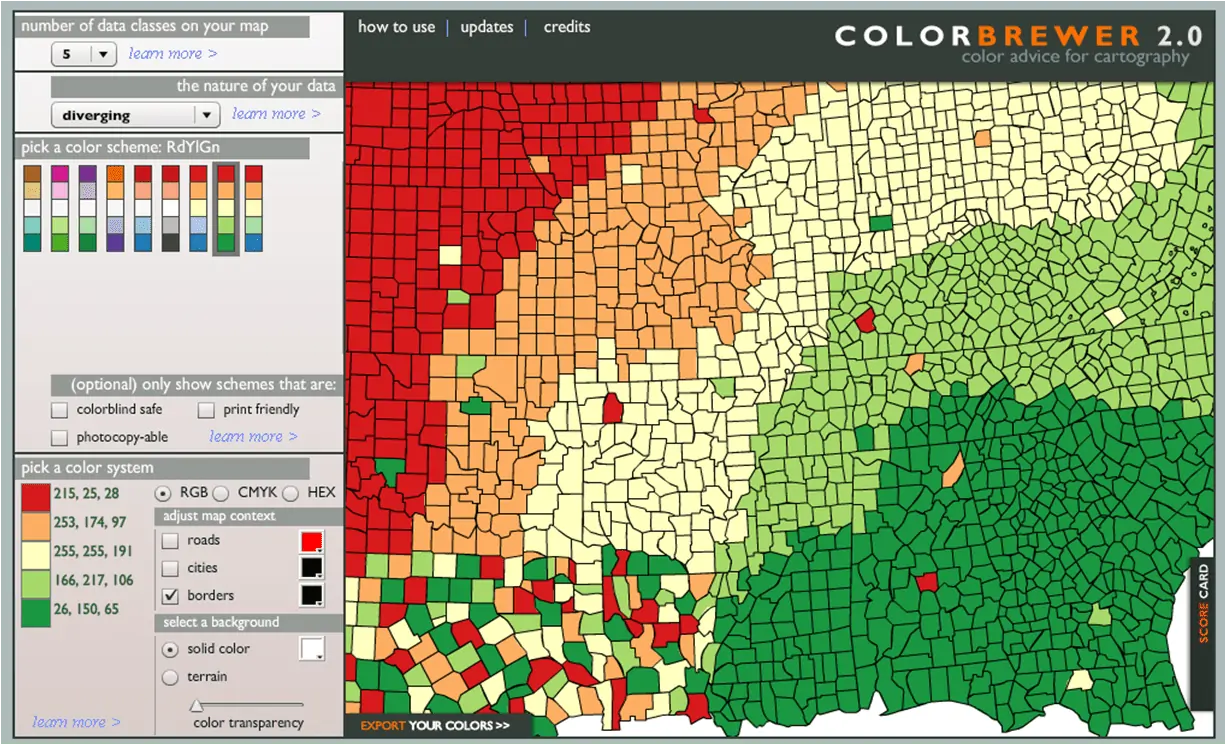
The same tool can be used to create a visually accessible version for colour-blind users.
Infographics: the visual power of information
While visualisations are often automatically generated to make sense of lots of data, hand-designed infographics can illustrate a specific point and we think these are increasingly being used as a way to stand out from the crowd. These visual representations often use graphics to express complex concepts or ideas so that they can be quickly absorbed and understood. Recent years have seen the rise of infographics in printed and online media to tell the story of data.
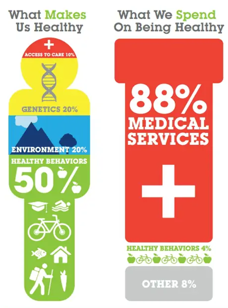
Infographics can also be used persuasively to convey a message. Popular with journalists, a graphic can harness the power of a surprising statistic to catch the reader’s attention. Here, a striking discrepancy between our health needs and government spending on health is forcefully illustrated.
Of course, infographics can be manipulated in order to convey the desired message. This misleading graphic appears to suggest that the travel industry is more dynamic in the Asia-Pacific region than in Europe. In fact closer attention reveals that the size of the travel industry remains larger in Europe than in Asia-Pacific throughout the whole period under review:
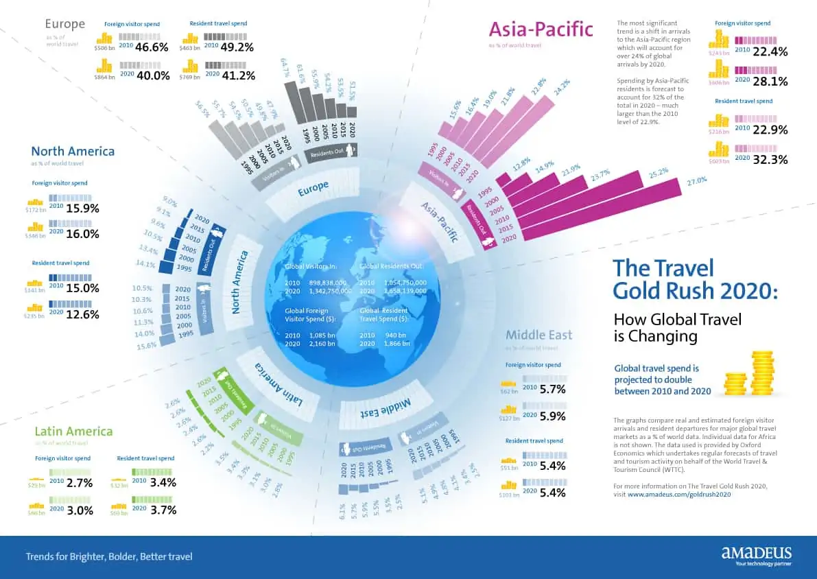
The bars have been distorted to emphasize the point, resulting in a deceptive representation of the facts – so be careful!
Visualisation is clearly a powerful tool and an essential component of a successful information strategy.
Red Olive runs training courses in effective visualisation. To find out how to use visualisation tools to tell the story of your data, contact Red Olive. You could give us a call 01256 831100 or send us an email via [email protected]. We look forward to hearing from you.
You can read more about creating a successful data strategy in our previous blog post: ‘Data and the Death Star: How to implement a successful business strategy’.